
A digital oil painting is not just a file. It carries, in every layer of color, a decision. A thickness, a direction, a hesitation that finally resolved itself. What is built hour after hour, brushstroke after brushstroke, is not a simple image in the computational sense… It is a painting. With everything that word implies in terms of time, sensibility, and relationship to material. And when the time comes to print it, only one support seems worthy of that work: Fine Art paper.
The question of the support is the question of how this painting will exist beyond the screen. How what was built in the light of the digital studio will translate, physically, onto a tangible surface that can be touched, hung, looked at in the real light of a room. This transition from screen to paper, or to canvas, is never trivial. It can reveal a painting… Or it can betray it.
It is a question I underestimated at the beginning. Not out of negligence, but because you do not immediately measure how far from neutral a support can be. It is easy to imagine that a good printer and a careful presentation paper are enough. That is wrong. An unsuitable support does not slightly degrade a painting: it transforms it into something else. Into something flat, ordinary, soulless.
This article is the story of that journey. The tests, the mistakes, and a rather bitter disappointment. And the certainty, in the end, that Fine Art paper is the only support that allows my paintings to truly exist beyond the screen, in all their depth and intensity.
Coated Paper, Photo Paper, Fine Art Paper: Three Different Worlds
Let us begin with a distinction that is rarely made, yet is fundamental. When we talk about printing, we tend to group under the same word supports that have almost nothing in common: neither their composition, nor their behavior with ink, nor their final result. Three major families coexist, each with its legitimate uses, each with its own characteristics.
Standard Coated Paper
Coated paper is a support designed for everyday professional printing. It serves its purpose very well in many contexts: brochures, catalogs, communication materials, promotional prints. Its surface treatment allows good image reproduction in these uses.
For reproducing a painting, however, it reaches its limits. Ink is absorbed differently: colors stay at the surface, contrasts flatten, and deep tones lose their density. The backgrounds, which in my paintings carry the full intensity of the chiaroscuro, come out dull. The subjects, whose light is born precisely from the relationship with those backgrounds, lose their radiance. This is not a question of support quality: it is a question of fit between the support and the use.
I experienced it firsthand. The first time I opened a package containing a print of my own painting on this type of support, I thought I was going to fall apart on the spot… What I had painted was no longer there. The depth had disappeared. What remained was an image among others, without character, without presence. That moment decided me to conduct serious research, and to methodically test each family of support until I found what would truly work for my paintings.
Photo Paper
Photo paper is another category, a serious one, with its own quality standards. I tested on my paintings the Fuji Crystal Archive DP II in matte finish (and many others…), a paper regularly cited as an excellent compromise, and one that deserves that reputation in many photographic contexts.
But for my paintings specifically, built on a strongly marked chiaroscuro, with very saturated colors and deep backgrounds crossed by luminous halos, this paper did not work. Despite its matte designation, its surface is reflective, and that reflectiveness interferes directly with the reading of the backgrounds and contrasts. Where I was looking for depth, I obtained a surface that caught and reflected the ambient light. And the colors were not quite there either.
This is not a flaw in photo paper as such. It has its full legitimacy for other types of images, other aesthetics. It simply was not made for what I do.
For a deeper look at the technical differences between print support families, I dedicated a full article to this question. Here, I focus on what I retained for my own works, and why.
The Fine Art Print
This is where everything changes.
Fine Art papers are manufactured specifically for high-quality artistic printing. Their composition, based on pure cotton or alpha-cellulose depending on the reference, guarantees acid neutrality and longevity that standard supports cannot offer. They are designed to receive pigment inks and give them depth, vibrancy, and chromatic consistency. Saturated colors retain their intensity. Contrasts are preserved. The deep backgrounds of my paintings recover their density, and the subjects their radiance.
Pigment inks play a central role in this result. Unlike dye-based inks, they resist fading over time and remain stable against light. On a quality Fine Art paper, properly stored away from direct light and humidity, a print can last several decades without significant deterioration. This is not a minor detail for a printed digital painting meant to live on a wall for years. If you have questions about preservation, the FAQ answers the most common ones.
The Three Fine Art Papers I Selected
After thorough testing conducted on my own paintings, I retained three papers, and one canvas option. Three different characters, three different relationships to color, light, and material. A selection built on concrete trials, not a list of principles.
On each artwork page in the shop, these three papers and the canvas are available, with their formats and prices. You choose the one that suits your eye, your space, and the use you wish to make of the work.
Hahnemühle FineArt Pearl 285 g/m²
This is my personal favorite. I say it plainly, and I own it entirely. It is a paper from Hahnemühle, a German paper manufacturer specializing in art supports since 1584.
The surface is slightly pearlescent, with a very elegant and restrained feel, something between matte silk and very soft satin. It is neither glossy nor truly matte. It is a subtle in-between, difficult to describe in words and immediately recognizable to the touch.
This paper places itself entirely at the service of the painting. It reproduces with remarkable fidelity the richness of saturated colors and the depth of dark tones. Light plays subtly on the pearlescent surface depending on the angle of view, creating slight variations that give the image an almost tactile presence.
One note: under very directional lighting, the pearlescent finish can generate slight reflections. Nothing comparable to a satin or glossy paper (it remains infinitely more discreet), but it is useful information if you plan a spotlight directly facing the hanging.
It is particularly suited to those who seek a rendering that is both intense and soft, in harmony between the painting and its support. A work on FineArt Pearl integrates well in varied spaces, under different lighting conditions, without ever betraying its colors.
Hahnemühle Photo Silk Baryta X 310 g/m²
A paper with a stronger character, that gives a painting breadth.
Its satin surface reveals colors in their full depth. Saturated tones burst out, contrasts are very pronounced, and the luminous halos in my paintings, those areas where light seems to be born from the background, are rendered with a fidelity I have not found on any other support. The result is rich, dense, with a particular physical presence.
One caveat when hanging: the satin surface presents a sheen that can generate quite noticeable reflections facing a direct frontal light source. I recommend hanging it slightly offset from a window or a frontal spotlight.
I deliberately kept this paper in my selection, fully aware of this. The richness of the colors it renders is incomparable, and that is what makes all the difference. I fully accept that trade-off.
It suits those who want an intense, contrasted rendering, with a work that asserts itself in a space and immediately draws the eye.
Canson Infinity Rag Photographique 310 g/m²
The third character, and the most different from the previous two.
This paper is ultra-matte. Its surface reflects nothing, seeks no effect. And that is precisely why it has its full place in the selection. The rendering is calm, balanced. The surface lets the painting express itself at its own pace, without emphasizing or dramatizing. For certain paintings, for certain spaces, this sobriety is exactly what is needed.
One thing to know: colors are softer here than on the FineArt Pearl or the Baryta. Contrasts are less pronounced, and dark tones lose a little of their density. That is the character of this paper, not a flaw. If your paintings rely heavily on deep blacks, this softness may surprise you. It may also suit perfectly a bright, open living space where you seek a discreet presence rather than an assertion.
A work on Canson Rag settles quietly, durably, in a bright and open environment. It suits those who want a soft rendering, without any sheen whatsoever. This paper belongs to the Canson Infinity range, the professional line of the French paper manufacturer Canson.
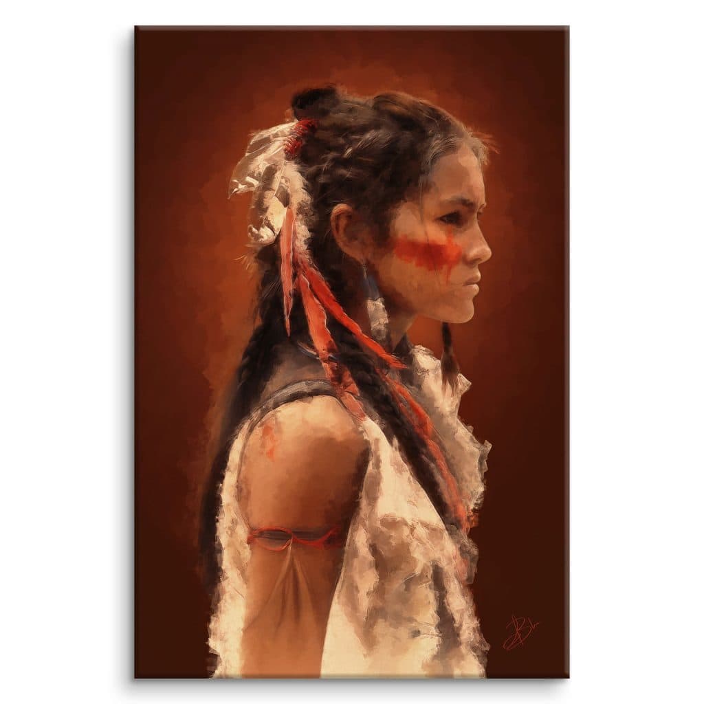
To see concretely how this choice is presented, you can browse the artwork page for Ahyv: the three supports are available there, with their formats and prices. What you find there is representative of all the works in the shop.
Canvas, a Choice in Its Own Right
Canvas deserves a special mention, and a clarification you rarely hear: it is not reserved for large formats. It is available for all dimensions.
What sets it apart from papers is its volumetric character. Stretched on a solid wood stretcher frame of 20 mm, mirror-wrapped edges, the work occupies space differently. It is three-dimensional, unlike a flat framed print. The image extends onto the sides of the frame, for a clean result directly on the wall, no frame required. The cotton texture also gives the image a discreet, tactile grain that changes the relationship with the eye.
One thing to anticipate: the result on canvas is naturally more subdued, less contrasted than on a paper print. The material absorbs differently, colors are more nuanced, blacks are softer. For certain paintings, that is exactly the effect sought. For others, paper will be more faithful to the digital original. The choice is yours, depending on the painting and the space.
You can see an example with the work Nyota, offered as a limited edition and available on canvas.
What Comes With Each Work
Each print is accompanied by a digital certificate of authenticity. It confirms that the painting was created by Blue (Alexandra Dubois). It carries the internal registration number of the work, and the characteristics of the print: support, format, edition.
On the subject of editions, I would like to clear up a misunderstanding that comes up regularly.
The works in the Wild Genesis, Equin’Essence, Anima Mundi and Radiance of Fragility collections are open editions. The Trésors d’Art collection offers limited editions, numbered.
What differentiates them is only the number of available copies. Not the quality of the paper. Not the care given to printing. Not the attention paid to packaging. The standard is exactly the same on both sides. I have no reason to do otherwise.
To discover my artistic approach and the story behind these collections, the artist page will tell you more.
Why This Choice Shapes My Entire Practice
My practice is digital oil painting. Depending on the project and my state of mind, I work sometimes on a Wacom Intuos Pro tablet, where the gesture happens on a surface separate from the screen, and sometimes directly on a Cintiq screen-tablet, where the brush touches the surface of the image in real time. Two different experiences, two different relationships to the gesture, but in both cases, the movement is there, physical, with its pressure and hesitations.
What I seek in painting is a certain relationship to light. My paintings often work on a principle of chiaroscuro: deep backgrounds, crossed by a luminous halo that seems to come from within, against which subjects with saturated, intense colors stand out. It is this relationship between background and subject, this way light seems to be born from the painting itself, that guides me in every work.
This very particular relationship between saturation, depth and light demands a support capable of rendering it honestly. Fine Art paper is the only one that achieves this. Its pigment inks hold the saturation of colors, preserve contrasts, allow luminous halos to retain their intensity. On another support, something is lost. And that something is precisely what I spent time building.
The choice of Fine Art paper came after the painting. First paint, instinctively, without calculating the support in advance. Then find what allowed what had been painted to truly exist beyond the screen. This choice was born of a concrete necessity, tested and verified on my own works, not from a positioning or an external constraint.
Why There Are No Exceptions to This Choice
A Fine Art print is a painting that leaves the screen with its depth intact.
Not a printed file. Not an interchangeable decorative object. A painting, on the support that resembles it, in the format and rendering you chose yourself, with its certificate and the intention that brought it into being.
When I think back to opening that first package… I can still see my face. That disappointment became a standard. And that standard, you will find it in every work in the shop. Three papers, one canvas, and the certainty that each was tested on my paintings before being offered.
If you have questions about the choice of support, about the preservation of a Fine Art print, or about any technical aspect, the FAQ answers the most common ones. And if you would like to contact me directly, the contact page is there.
All the collections are waiting for you.
Frequently Asked Questions About Fine Art Paper
Why print a digital painting on Fine Art paper rather than on ordinary paper?
Because an ordinary paper flattens what is most precious in a painting. On a standard coated paper, the colors stay on the surface, the contrasts sag, the deep backgrounds lose their density. Fine Art paper, on the other hand, receives the pigment inks while giving them back their depth and their intensity. For my paintings built on chiaroscuro, it is the only one that betrays nothing.
Which Fine Art paper do you prefer?
My favorite, without hesitation, is the Hahnemühle FineArt Pearl. Its slightly pearlescent surface sits somewhere between matte silk and a very soft satin, hard to describe and immediately recognizable to the touch. It keeps the richness of the saturated colors and the depth of the dark tones, while letting the light play gently depending on the angle. It places itself entirely at the service of the painting.
What is a pigment ink, and why does it matter?
Unlike dye-based inks, pigment inks resist fading and stay stable in the face of light. It is no accident that one speaks of museum quality, for these are precisely the inks and papers that museums use to preserve their prints over the very long term. On a quality Fine Art paper, away from direct sunlight and humidity, a print can cross several decades without truly altering.
Is canvas reserved for large formats?
No, that is a misconception. Canvas is available for every dimension. What sets it apart is its volume. Stretched over a wooden frame, mirrored edges, the work occupies the wall in three dimensions, where a flat framed print stays flat. Its rendering is softer, a little less contrasted than paper, which suits organic subjects particularly well.
Which support should you choose if the work will hang facing a window?
I would steer you toward a matte paper like the Canson Rag Photographique. I did the tests myself, it returns no reflection at all, not even facing a direct source. Satin surfaces like the Photo Silk Baryta reveal the colors superbly, but they can catch a frontal light. Often, it is enough to offset the hanging slightly from the window, but it is worth thinking about at the moment of choosing.

