
You have just created, or acquired, a digital painting. An artwork that perhaps embodies a precious memory, a particular emotion, or an artistic vision you want to bring to life in your space. But before printing it, one essential question arises: How do you choose the ideal print medium for your digital painting?
Photo paper, Fine Art paper, canvas or even modern supports such as aluminium or plexiglas… The options are numerous, and every medium has the power to transform your artwork in a significant way. The right choice will enhance your painting, while a poor one could diminish its visual and emotional impact.
Printing your artwork is a decisive step that goes far beyond simple reproduction. The choice of print medium directly influences the final result, its longevity, and its perception. It determines the visual and emotional impact of the work, from textures to colors.
With the right medium, your digital creation can become a tangible and timeless piece of art.
In my studio, Graph’Art Studio, I paint digital oil paintings with highly saturated colors, deep backgrounds crossed with luminous halos. This particular style has led me to choices of media built from my own tests on my own works. A pearlescent paper like the Fine Pearl, or a satin one like the Baryta Silk I offer in my shop, supports this chromatic richness better than other finishes. A heavily textured canvas, on the other hand, risks letting the support speak louder than the painting itself. This is a conviction that comes from practice, not from a general recommendation.
This complete guide walks you through every step of this decision, with practical advice and in-depth explanations to ensure your artwork finds the medium that will truly bring it to its full potential.
Why the choice of medium matters
The print medium you choose is not merely a physical surface or a technical consideration. It influences several crucial aspects of the artwork:
- Color depth. Some media, such as glossy or satin papers, intensify contrasts and give colors incredible vibrancy. Others, like matte or textured papers, offer a more subtle and gentle result.
- Detail precision. The level of texture and quality of the medium also play a very important role. A Fine Art paper can reveal the finest nuances and details of your painting, while a canvas brings unmatched pictorial depth and a sense of physical presence.
- Overall atmosphere. A canvas creates a different effect from paper, and the choice between a matte or glossy finish completely changes the emotion conveyed by the artwork. A matte finish, for example, brings a discreet elegance, while a glossy finish intensifies colors for a striking effect. That said, the unwanted reflections of glossy or satin finishes are worth anticipating.
- Longevity. High-end media, such as Fine Art paper or certain quality canvases, are designed to withstand time and wear. UV-protective framing glass or a protective varnish can also extend the life of your artwork while enhancing its appearance.
With the right medium, your artwork can become a timeless piece, capturing the essence of your creative intention while passing through the years without losing any of its beauty, much like a traditional oil painting. This is truly about elevating your artistic vision!
Understanding your digital files
If you are not very familiar with the world of digital images, this section is for you. Even if everyone knows the JPEG, PNG or TIFF formats, do you truly understand the differences between them? For those already familiar, consider this a quick refresher, as the file format is one of the first elements to consider when preparing a print.
Note. The points raised here concern digital paintings specifically. Photo requirements may differ and would deserve a dedicated article.
Key concepts
- Raster image. A raster image is made up of small squares (pixels), each with a defined color including a hue, luminance and saturation. Think of it like a cross-stitch embroidery, where each stitch contributes to the overall visual. JPEG, PNG and TIFF are examples of raster formats.
- Compressed image. Compression reduces information that is unnecessary to the human eye, which lightens the file. However, lossy compression permanently discards certain data, which can affect image quality if the compression is too heavy.
- Color depth (8, 16, 32 bits). This indicates the amount of information available to describe colors and gradients. In art printing, 16 bits can better preserve very smooth transitions (sky, skin, shadows, flat tones). 8 bits remains common and can deliver excellent results, but is more susceptible to banding on delicate gradients. 32 bits is mainly for very specific uses (HDR, compositing) and is not necessary for most prints.
Common image formats
| Format | Type | Advantages | Drawbacks |
|---|---|---|---|
| JPEG | Raster, compressed (lossy, generally limited to 8 bits) | Light file size, very compatible. Ideal for web, sharing and many standard prints, provided it is exported with reasonable compression. | Excessive compression = loss of detail (especially in flat tones and gradients). Generally limited to 8 bits. Quality depends heavily on export settings. |
| PNG | Raster, compressed (lossless) | Lossless quality, transparency, excellent reproduction of fine detail. Compatible with most viewing software. | File size is often large, which can slow down uploading and processing, especially at large formats. Compatibility varies by printer. |
| TIFF | Raster, uncompressed or losslessly compressed (depending on export). | Maximum quality, widely used for demanding print workflows and professional printing. | Large files, slower to transfer and process. Less practical to open or share depending on the software. |
What about other formats?
Other formats exist, such as WEBP, BMP, RAW, NEF or GIF, but these are rarely used for art printing. They are generally optimized for other uses (web, raw photography, animations, etc.) and do not meet the specific requirements of high-end printing. A GIF for a Fine Art print… I barely dare imagine the result.
A practical tip
When choosing the format, think about the final use of the artwork. A print intended for a gallery or professional setting will benefit from a TIFF file. For home decoration, a PNG or a well-optimized JPEG will be more than sufficient.
At Graph’Art Studio, I work exclusively in TIFF, a format particularly reliable for print preparation. Depending on the printer’s constraints, other formats may then be used, but my reference file is always the TIFF.
★ If you would like a controlled printed result, you can explore my prints and custom creations based on your photos on my website.
The different print media
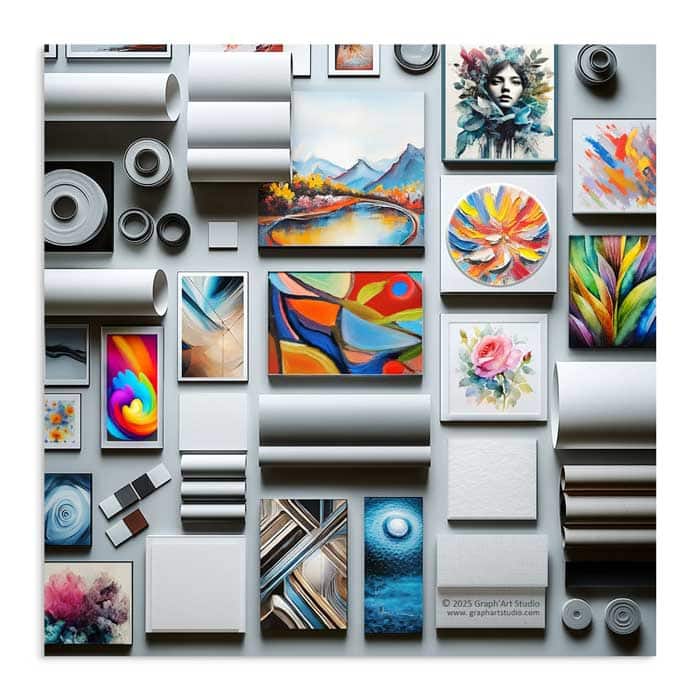
Let’s get to the heart of it. Which medium to choose to bring out the best in your digital artwork? It all depends on the nature of your artwork, the effects it contains, the desired final result, and of course, your budget.
Choosing a medium is also an artistic choice, favouring a subtle matte paper or a canvas for a pictorial effect, a modern support like aluminium for a contemporary look, or a Fine Art paper for museum-quality output.
It is essential that this medium reflects your artistic vision while integrating harmoniously into your space.
There are many types of photo paper, Fine Art paper, canvas, and other media. Each printer often has their own preferences, influenced by their convictions or the technical specifics of their machinery.
For my part, my recommendations are based on extensive tests carried out on my own digital creations. These experiences have allowed me to identify solutions that offer excellent value for money, suited to personal use as well as professional projects.
These suggestions are not intended to be universal. They can be adjusted according to your printer’s constraints, your specific expectations, or the wishes and recommendations of the artist. The aim is to provide you with a solid basis for making a more informed choice.
Entry-level prints, things to watch before you order
Highly accessible prints are widely available today through online services, sometimes offered as print-on-demand. This can work for simple decoration or non-demanding designs, but the result varies considerably depending on the paper used, the inks, the automatic settings and quality control.
A few useful things to watch before placing an order
- Uncertain actual medium. The “premium” paper advertised often remains vague. Without a precise reference (brand, weight, paper type…), it becomes difficult to anticipate the result.
- Unpredictable colors and contrasts. Some services apply automatic corrections (contrast, saturation, sharpness) that cannot be disabled. This can modify the intention of the artwork.
- Finishes and reflections. In glossy or satin, the result can look very “photographic” and create marked reflections, especially under indoor lighting. In matte, some entry-level papers can absorb ink unevenly, sometimes giving a marbled appearance, particularly on artworks with heavy flat tones or textures.
- Limited longevity. At this price point, resistance over time (to light, humidity) is not comparable to a Fine Art pigment print.
- Simple advice. If the service offers samples, this is often the safest way to check quality before printing an important artwork. I learned this the hard way. Once is enough.
If your goal is to get a reliable and flattering result, it is better to choose a clearly identified medium and a specialist printer who gives precise information about their materials and processes. That said, these solutions can work very well for simple visuals, or for testing a format before a more ambitious print.
Photo paper, affordable and versatile
Even if it may seem unconventional, photo paper remains an accessible option for printing a digital painting, and can offer a luminous and contrasted result. It may suit certain texture effects, but the result depends on the finish, the specific paper and the lighting. This medium is therefore not suitable for all creations.
My Preference
- Photo print on Fuji Crystal Archive DP II (Matte), 220 g/m²
This paper offers a matte finish, which is often a relevant compromise. It limits the mirror effect of a glossy paper, even if it does not completely eliminate reflections: depending on the lighting and viewing angle, they can still be present. The result remains contrasted, with good detail retention, making it a coherent option when looking to balance print quality, longevity and budget. In practice, this choice often proves more convincing than certain alternatives, notably ultra-matte types like Velvet, which can sometimes soften the depth and richness of colors and give a more washed-out result.
A word on glossy finishes
I generally advise against glossy finishes for printing digital paintings, unless the artist specifically recommends this choice. Although these finishes can sometimes enhance certain details, they can also create unwanted reflections, altering the perception of colors and textures. This can be detrimental to the final result, especially for artworks where subtle nuances and contrasts play an important role.
Fine Art paper, elegant and timeless
Pigment printing on Fine Art paper is an excellent choice when you wish to render the most subtle nuances of a digital artwork, with a more “material” feel and a more refined reading of the details. Made from noble materials such as cotton or alpha-cellulose, these papers allow very faithful reproduction of colors and details, while bringing unique depth and texture.
Whether for oil paintings, acrylics, watercolors, or even a reproduction of an artwork, Fine Art paper is chosen both according to your preferences and the nature of the image. In practice, it does not only change the aesthetic. It influences the perception of depth, the softness of transitions, and the way light falls on the print.
This is also what explains its frequent use in galleries and art publishing. Beyond the result, these media are designed to last, their stability and quality of manufacture contributing to better preservation over time.
The right choice then depends on the desired result (smooth, satin, very matte, textured) and how much space you want to give to the paper’s texture. With the right Fine Art medium, the image gains presence: you are no longer simply printing, you are bringing the artwork into another dimension…
My Fine Art paper selection
This selection reflects my experience and personal tests. It is not intended to replace the advice of a printer, but to give concrete reference points for making a choice.
- Hahnemühle FineArt Pearl (285 g/m², 100% alpha-cellulose)
A pearlescent paper with a discreet texture and a finish that catches the light slightly. It preserves depth, strong contrasts, and a more luminous feel than classic matte, without crossing into the “glossy” effect of bright or overly satin supports. It is elegant and versatile, particularly for artworks where blacks and details need to retain presence.
Watch out. The pearlescent/satin aspect can reveal more reflections depending on the lighting and viewing angle, especially on large dark surfaces.
- Hahnemühle Photo Silk Baryta X (310 g/m², 100% alpha-cellulose)
A baryta paper with a smooth surface and a satin (silky-gloss) finish. It gives a dense, more photographic result, with deep blacks and very clean contrast. I use it when I want a rich and assertive result, more present than a matte, while avoiding the mirror effect of a glossy.
Watch out. Like all satin baryta papers, it can show reflections under direct light. Worth anticipating if the artwork will be displayed facing a window or under spotlights.
- Hahnemühle Photo Rag Ultra-Smooth (305 g/m², 100% cotton)
A 100% cotton paper, ultra-smooth and very soft to the touch. Its texture is so fine that it adds almost nothing visually, and its matte finish offers a very comfortable reading experience, with no reflections in most lighting conditions. It is ideal when I want to preserve a velvety, sharp and very detailed result, without grain interfering with the image.
Watch out. Its matte finish and ultra-smooth surface can give a softer result on some highly contrasted visuals.
- Canson Infinity Rag Photographique (310 g/m², 100% cotton)
An ultra-matte, very smooth paper designed for precision and softness. It has a real ability to reproduce fine details, with an impeccable result and a surface that remains understated, with no marked texture and no reflections. I find it particularly coherent when I want a “classic” Fine Art print, balanced, one that does not overshadow the artwork, and lets colors and values do the work.
Watch out. As it is a very matte paper, large dark areas may appear slightly less deep than with a satin or baryta medium.
- Canson Infinity Arches Aquarelle Rag (310 g/m², 100% cotton, OBA-free)
This is a paper with a watercolour grain (textured surface, matte finish), with a clear tactile and visual presence. It easily gives a very deliberate “art paper” dimension, perfect when you are looking for an authentic, organic result, with a texture that participates in the final character.
As it is heavily textured, it deserves a conscious choice: on some artworks, it elevates; on others, it can become too dominant. It is particularly well suited to watercolour reproductions, thanks to its grain and its very “artist paper” feel.
Watch out. Avoid files that already include a texture effect: texture on texture will give an overloaded result.
- Hahnemühle Torchon (285 g/m², 100% alpha-cellulose)
The Torchon embraces a heavily structured, felt-like texture with a strong grain and a cloudy appearance that is immediately visible. It brings a very tactile dimension and can give a very artistic character when the image lends itself to it. In return, it is a paper that “speaks loudly”: on some compositions it is magnificent; on others, it can dominate. It works perfectly for watercolour reproductions, reinforcing the authentic and textured character of the result.
Watch out. To be reserved for artworks that can handle a dominant texture. As with the Arches, it is better to avoid files with built-in texture.
Canvas, a different artistic dimension
Printing on canvas brings a very particular presence. The grain, the slight absorption of inks and the way light catches the surface often give a more “pictorial” result than a paper print. In return, you have to accept that a canvas does not display an image in the same way as photo paper or Fine Art paper.
Main canvas types (material and quality range)
Print canvases are distinguished first by their material, as it influences the hold, flexibility, texture, and stability over time.
- Cotton canvas. The most common. Its feel is natural, the grain is often pleasant, and it suits visuals that benefit from becoming more “material.”
- Polyester canvas. Often smoother and more moisture-resistant. The result can appear sharper, sometimes more photographic, depending on the model and coating.
- Mixed canvas (cotton + polyester). It seeks a balance: some of the feel of cotton, some of the stability of polyester. A balanced choice when looking for a good compromise between result, resistance and ease of maintenance, without sacrificing quality.
- Linen canvas (artist grade / high end). Linen is often considered more robust and more stable over time. It also has a visual character, with a grain that can appear more refined depending on the weave. In printing as in painting, it is generally offered in more demanding ranges, but often at a higher cost.
An important point. Depending on the printer, a canvas is not just “cotton” or “polyester.” It often receives a preparation layer (called a coating) that allows the ink to adhere properly and reproduce colors. And this layer can vary from one manufacturer to another. The result: two canvases both described as “cotton” can produce different results, simply because their preparation is not the same.
Matte, satin and glossy finishes, and what they really change
The choice of finish alters the reading of the artwork, especially under indoor lighting.
- Matte finish. It offers a more natural and stable reading, particularly pleasant on artworks with a pictorial feel. It diffuses light slightly, giving a softer result. In everyday use, it is also more forgiving, as it shows small marks less easily.
- Satin finish. This is a middle ground. It retains a bit more density and contrast than matte, with generally more contained reflections than glossy. Very useful when you want depth without tipping into the “mirror” effect.
- Glossy finish. It intensifies the sense of contrast and color, but reflections quickly become dominant. Marks and micro-scratches are also more visible. To be reserved for cases where the intended effect is deliberate.
In conclusion, the choice of canvas and its finish depends on several factors, namely the nature of the artwork, the desired visual effect and the display conditions. For an optimal result, it is often preferable to rely on the recommendations of the artist or the print professional, who will be able to tailor their advice to the specific requirements of each project.
Tip. When printing on canvas, I recommend opting for mirror edges (also called “reflected borders”). This technique extends the edges of the image by reflecting its extremities onto the sides of the canvas, creating visual continuity without cropping the precious details of the original artwork.
Modern supports, aluminium and plexiglas mounting
If you are considering a modern support such as aluminium or plexiglas (acrylic glass), keep one important point in mind. In most cases, the final result depends first on the print, then on the support. Apart from certain direct-on-aluminium printing options (such as Dibond), these finishes are often obtained from a print on paper, then mounted onto the rigid support.
In other words, the quality of the paper and the print remains decisive. Sharpness, black depth, color accuracy, longevity. This is why it is useful to think first as you would for a photo or Fine Art print, and then choose the mounting that matches the desired effect.
For a harmonious result, I recommend avoiding very glossy finishes. They can generate marked reflections and complicate the reading of the artwork, especially under indoor lighting. A matte or slightly satin finish is often more balanced, preserving a contemporary look while letting the image breathe.
A few technical aspects to consider
Color management
Variations sometimes occur between the image displayed on screen and the final printed result. These differences are linked to several factors, such as device calibration (computer, tablet, phone) and the specific characteristics of the print medium.
- Device calibration. Every screen displays colors differently depending on the quality of the device, its brightness settings, and ambient lighting conditions.
- The specifics of the print medium. Whether you choose a matte, glossy, textured paper or a canvas, each material interacts with ink in a unique way, influencing the saturation and vibrancy of colors.
The choice of color profile plays a decisive role in ensuring a faithful and harmonious rendering of your artworks. For this reason, it is essential to work with an experienced and reputable printer, whether through an online service or a local shop. The quality of the print depends greatly on the printer’s expertise, who must be able to respect the technical specifications of your files.
Before finalizing your project, make sure to check with them the compatibility of the color profile used for your artwork, and confirm that they have a thorough understanding of color management in order to avoid any alteration of nuances or contrasts.
Warning. Some online printing services or printers offer automatic image optimization via artificial intelligence (AI). I recommend not activating this option. If your files are already carefully optimized, any additional modification risks altering colors, contrast and brightness, which could harm the quality of the final artwork. If this option is enabled by default, consider disabling it or setting the percentage to 0 to preserve the original quality.
Dimensions and resolution
For a flawless result, follow the dimensions recommended by the artist, seller or printer, and make sure the file is properly sized for printing (minimum 300 DPI). Significantly enlarging an image beyond its intended size can lead to a loss of sharpness, even if this is not immediately apparent on screen.
Preserving your artwork
Once your artwork is printed, a few simple steps can make a real difference over time. Avoid direct sunlight, as UV rays gradually wear down colors, and favour a place where temperature and humidity remain fairly stable. For a paper print, framing under glass, ideally UV-protective, protects both the image and its longevity. For a canvas, a suitable varnish adds a useful barrier against dust and humidity, while reinforcing everyday resistance.
This is not preciousness. It is simply recognizing that something was created to last.
When the medium becomes part of the artwork
Giving a digital painting physical form through printing is much more than a simple technical act. It is a way of bringing a virtual creation into the tangible world, of transforming an artistic vision into a piece that stands the test of time. This guide has explored in detail the choices of media, papers, canvases… to offer you a solid foundation for making informed choices, tailored to your needs and aspirations.
Every decision contributes to bringing the artwork to light. By respecting the specificities of each medium and paying attention to color management and dimensions, you will give your creations the attention they deserve.
Printing is the alliance between technical skill and artistic sensitivity, and every detail matters. By following the advice outlined here, you will be able to transform your digital artworks into true pieces of art, faithful to their spirit and original intention.
Frequently Asked Questions About Print Media
Which file format should you choose to print a digital painting?
TIFF remains my reference. It keeps all the image information without compressing it, whereas a JPEG, in trying too hard to lighten the file, ends up nibbling away at the details in flat areas and gradients. In between, PNG offers a good compromise, lossless but easier to handle than a TIFF. For my part, I always work in 16-bit rather than 8-bit, to preserve the finesse of the transitions and all the richness of the colors. In print, these are the choices that make the difference.
Is a matte or glossy finish better for a digital painting?
It depends on the effect you are after, and it is not necessarily one or the other. Gloss intensifies the colors but multiplies reflections, matte calms them with no glare at all. For my paintings, the paper that reconciles the two is the Hahnemühle FineArt Pearl. Its pearlescent surface gives the colors the intensity of a satin finish, without the glare of a glossy one, and it has in addition a real texture, a paper structure you can feel under your fingers. It is the one I recommend, but in the shop I leave the choice open, because at heart it remains a matter of taste, and my paintings sit well on all three supports.
Is photo paper suitable for a digital painting?
It is suitable, and it renders beautiful colors. The matte Fuji Crystal Archive, I used it myself for a time to print my paintings. But despite its qualities, I always sensed a gap with what a Fine Art paper can reach. Its surface remains reflective. So yes, photo paper has its place, but it all depends on the painting and the intention you are looking for.
Why can two canvases described as “cotton” render differently?
Because the material is only part of the story. Before receiving the ink, a canvas is given a preparation layer, the coating, which changes the way the colors take hold. The structure of the weave matters too, its grain more or less tight. Two 100% cotton canvases prepared and woven differently will not render the same depth or the same result. It is a detail you often discover once the print is in your hands.
Are cheap print-on-demand prints worth it for an artwork?
For a simple visual or a format test, why not. For a work you care about, I stay cautious. The exact paper is rarely specified, and its durability over time has nothing to do with a pigment print. If the service offers a sample, that is the best way to check before committing.
Should you enable the image enhancement options offered by printers?
It depends on your file, but for a digital painting already carefully worked, my answer is clear. Turn everything off. These automatic optimizations of contrast or saturation are designed to rescue ordinary images. On a work whose depth has been built with care, far from correcting anything, they sabotage the result. And if these options are enabled by default, which happens more often than you would think, bring them back to zero.

