
To fully understand why a print can differ from what you see on screen, it is essential to understand what color space means and explore the basics of colorimetry.
When you create a digital image, color is at the heart of the process. Every hue, every nuance contributes to the emotion and visual impact of the work. But between the screen on which the image is designed and the final print, a whole technical world separates the digital from the paper or canvas.
Digital fine art painter, I work with deeply saturated colors, rich backgrounds, and luminous halos that put this very subject to the test with every print. For a digital oil painting with saturated colors, the gap between screen and Fine Art print often comes down to deep blues and vivid reds, the first hues to fall outside the printable gamut. This is precisely where color space comes into play.
Why does a vivid color on screen sometimes look duller once printed? Why do certain contrasts soften? Color space plays a key role here. When an image moves from digital to print, it undergoes a transformation. Screens display colors using the RGB model, while printers work with CMYK. Add to this ICC profiles, the limited range of inks, and other technical parameters that directly influence the final result.
This may all sound a little technical for now, but don’t worry: by the end of this article, these concepts will feel much clearer and more familiar.
Anticipating these color shifts is essential to avoid nasty surprises and ensure a print that stays true to the original vision. Understanding how colors are interpreted and reproduced allows you to adjust your files more effectively right from the start.
Whether your image was born from a camera, a digital brush, or a graphic composition, these concepts will help you better master color management and achieve professional-quality prints. And for those who already know the subject, consider this a revision before a surprise quiz!
Understanding the Basics of Colorimetry
The Most Common Color Models, RGB, CMYK, and LAB
What Are They For and Why Are There Several?
Color models are systems for representing colors in numerical form. Each model is designed to meet specific needs depending on the medium and the method of color reproduction.
RGB (Red, Green, Blue): This model is based on the additive synthesis of colors. By combining the three primary colors of light (red, green, and blue) at different intensities, it produces a wide range of colors. RGB is used for devices that emit light, such as computer and television screens, as well as the sensors of digital cameras.
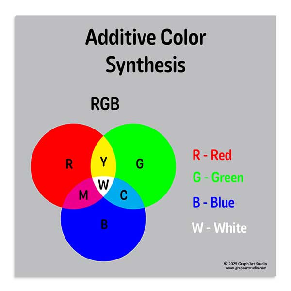
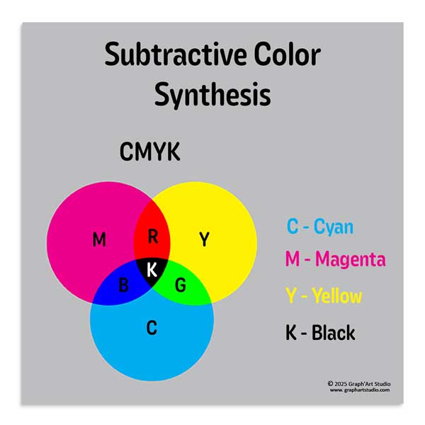
CMYK (Cyan, Magenta, Yellow, Black): This model is based on the subtractive synthesis of colors. It uses cyan, magenta, yellow, and black inks to absorb certain wavelengths of light and reflect others, thus producing the perceived colors. CMYK is the standard for printing processes, as it corresponds to the inks used in printers.
LAB: This model, based on human color perception, is device-independent. It consists of three axes.
L* for lightness
A* for the green-red axis
B* for the blue-yellow axis
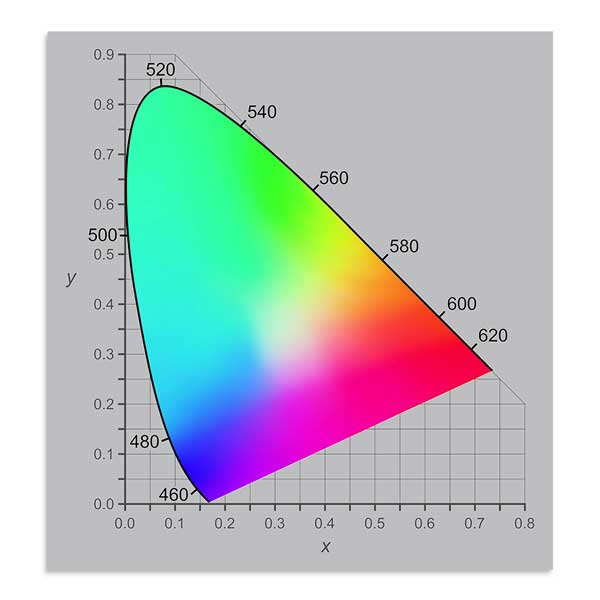
LAB is often used as an intermediate model in color conversions, because it encompasses all colors perceivable by the human eye, unlike RGB or CMYK, which are limited by their gamut.
The existence of several color models is explained by the diversity of media and color reproduction technologies. Each model is optimized for a specific context, ensuring accurate color representation according to the intended use.
Which Model to Use Depending on the Purpose (Screen, Print, Retouching)?
Screen: The RGB model is the most appropriate, as screens display color by combining red, green, and blue light. Working in RGB ensures consistency between what you create and what you see on screen.
Print: Even though printers deposit inks (often in CMYK), this does not mean you always need to convert your files to CMYK yourself. In many digital printing and photo printing workflows, files are accepted in RGB and then converted by the printer according to their equipment and profiles, which can produce a better-controlled result when the service provider has good color management in place. For certain projects (in particular offset / editorial printing), the printer may require a file already prepared in CMYK. The right reflex remains simple: follow the printer’s recommendation.
Retouching: In most cases, retouching is done in RGB, then the final result is checked via a print profile (soft proofing) if the image is intended for printing. The LAB model can exist in some tools as a “technical” space.
Color Spaces, sRGB, Adobe RGB, ProPhoto RGB…
Why Does the Choice of Color Space Impact Colors?
A color space defines the range of colors (or gamut) that a device can display or reproduce. The choice of color space directly influences the richness and accuracy of the colors in your images. A space with a narrow gamut can limit the available nuances, while a wider space allows for a broader color palette.
Comparison of the Most Common Color Spaces
sRGB: The standard for the web and consumer screens, it offers a narrower color range but ensures color consistency across different devices. However, this limitation can result in a loss of nuance, particularly in the most saturated hues.
Adobe RGB: This space offers a wider color range than sRGB, particularly in greens and cyans. It is often used by imaging professionals for work intended for high-quality printing.
ProPhoto RGB: With an even wider color range, ProPhoto RGB is mainly used in professional photography and advanced post-production. It allows for the preservation of a maximum of nuances during retouching. However, rigorous color management is required to avoid color shifts, particularly when converting to more restricted spaces such as CMYK or sRGB.
8-Bit, 16-Bit, 32-Bit and Why It Can Change the Rendering
The “bit depth” of an image (8-bit, 16-bit, 32-bit) describes, simply put, the level of precision with which colors and especially gradients are recorded.
In 8-bit, on very smooth areas such as a sky, a soft shadow on a wall, or a gradient background, the transition may not be perfectly continuous: small steps or color bands can appear. This is known as banding, the nemesis of photographers… and of those “too clean” backgrounds.
In 16-bit, these transitions are generally much smoother, which is particularly useful if the image has been retouched (contrast, saturation, curves) or if it contains large delicate gradients.
32-bit mainly concerns very specific HDR uses (images with a very wide dynamic range) and is not the most common format for preparing a file intended for printing.
And the Other Models (HSV, HEX, Pantone)?
Beyond the common models, there are other ways to describe color, suited to specific uses.
- HSV/HSL are practical for adjusting a hue or saturation in an intuitive way.
- HEX is a notation used on the web to encode an RGB color (e.g. #FF5733).
- XYZ belongs more to the domain of reference models and colorimetric calculations.
Pantone, meanwhile, works differently: these are “spot color” inks used when a very precise hue is needed, often in brand identity work.
For image printing (photos, illustrations, digital artworks), the essentials remain RGB/CMYK, color space, and ICC profiles: this is where most of the differences between screen and paper play out.
To go from digital to print without unpleasant surprises, three reference points cover the essentials: RGB belongs to the world of screens, CMYK to the world of inks, and LAB often serves as a useful bridge when a color needs to be translated from one world to the other.
The choice of color space matters too. sRGB remains the most universal and can yield excellent results in print when the printer handles it well. Adobe RGB and ProPhoto RGB offer a wider palette, but require more rigorous color management to avoid discrepancies.
In short, once these basics are in mind, you stop being subject to the conversion: you anticipate it… and when the print arrives, there is far less apprehension about how the colors will look.
How Color Space Creates the Gap Between Screen and Print
How Colors Display on Screen vs. How They Are Reproduced in Print
When you create an image on screen, the colors displayed are generated using the RGB (Red, Green, Blue) model, based on additive synthesis. This means that the light emitted by the screen combines these three colors to produce a wide range of bright, vivid hues.
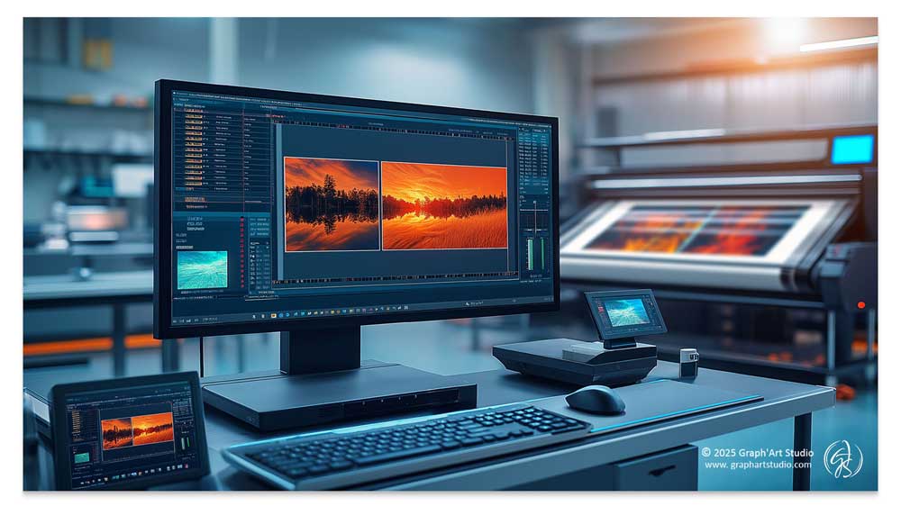
In contrast, printing relies on the CMYK (Cyan, Magenta, Yellow, Black) model, which works through subtractive synthesis: inks absorb certain wavelengths of light and reflect others to create the colors perceived by the eye. This change in reproduction mode leads to natural variations in rendering: some colors visible on screen cannot be reproduced identically in print, in certain specific cases (printing with “spot color” inks such as Pantone), a very precise hue can be targeted, but this is not the most common production method.
Gamut Limits and Their Impact on Hues and Contrast
Every system has its limits: a screen can display very bright colors that ink on paper cannot always reproduce identically. This is what is called the gamut, meaning the portion of colors that a medium can actually display or reproduce.
Result: when moving from RGB to a print workflow, certain very vivid hues need to be slightly adjusted to remain printable. The key idea is simple: not all colors visible on screen are necessarily “reachable” on paper, because ink and the medium impose physical constraints.
A well-managed conversion does not sabotage the image… it adjusts certain nuances in a consistent way to preserve the overall balance and harmony of the final result.
How to Limit the Differences
Achieving vivid colors in print while respecting gamut constraints requires a rigorous approach. To avoid unpleasant surprises, two reflexes already make a real difference:
- Preview the result with a soft proofing simulation when possible.
- Monitor out-of-gamut colors (some software flags them), so you can adjust in advance rather than having to deal with an automatic conversion.
And if a very precise color is essential (often in brand identity work), Pantone inks can be an option, but this is not standard for image printing.
And What About Blacks in Printing?
Black is a complex shade in printing, as its rendering varies depending on the color model used and the print medium. A well-managed black brings depth, contrast, and elegance, while a poorly prepared black can look “lighter,” especially on certain matte papers that absorb more ink.
On screen, a black like #000000 depends heavily on brightness, contrast, and screen type settings, which is why it does not always “look the same” from one device to another.
And once on paper, a black composed solely of K 100% can appear less dense. This is why printers sometimes use a rich black (with a little cyan, magenta, and yellow) to gain depth, particularly on large flat areas.
Other Factors Affecting Printed Colors
To make things a little more complicated, the differences between screen and print are not solely due to color models. Other elements play the role of troublemakers, influencing the final result and sometimes holding a few surprises in store.
- Device calibration: Every screen displays colors differently depending on its quality, brightness settings, and ambient lighting conditions. The result will not be the same whether you view your file on a standard screen, a tablet, a smartphone, or a professional screen calibrated to display exactly what will come out in print.
- The print medium: Velvet, matte, glossy, textured paper, or canvas, each material reacts differently with ink. A matte paper absorbs more ink and produces a softer result, while glossy paper enhances contrast and color saturation but can create unwanted reflections. Canvas printing, meanwhile, adds a texture and depth that can alter the perception of detail. The takeaway: the same file can look completely different depending on the chosen medium… so it is worth thinking carefully before diving in headfirst! If you would like to explore this further, I have written a dedicated article: Which Print Medium for Your Digital Painting?
- Print quality and the choice of printer: Print quality plays a key role in the final result. An experienced printer will know how to optimize settings and use the right equipment to ensure accurate colors, good contrast management, and consistent output. Conversely, mediocre print quality can lead to color variations, uneven saturation, or loss of detail. Choosing a reliable printer, whether online or at a specialist shop, is therefore essential to achieve a result that meets your expectations.
Quick Summary
As you may have gathered, the color differences between screen and print come down first to a change of “language.” The screen displays in RGB (light), the print translates into inks, with physical limitations. Added to this is the concept of gamut: certain very vivid hues need to be adapted to remain printable. Finally, beyond the color profile and screen calibration, the medium also plays a direct role in the rendering. In other words, mastering color space does not stop at the file level, it also means accounting for the paper or canvas on which the image will come to life.
The Importance of ICC Profiles
What Is an ICC Profile and What Is It For?
An ICC profile (International Color Consortium) is a file that describes how a device reproduces colors in relation to its color space. It acts as an interpreter between different peripherals (screens, printers, scanners) to ensure consistent color management throughout the creation and printing process.
Why Is This Essential?
Without an ICC profile, each device would interpret colors in its own way, leading to sometimes considerable differences between what is displayed on screen and the printed result. The outcome? A random color conversion, shifted hues, altered contrasts… and a big disappointment at the printer. The right ICC profile therefore allows for better control over the conversion, and makes it possible to preview the result via soft proofing, provided you are working on a properly calibrated screen.
One important point: many printers offer their own proprietary ICC profiles. Using these is often the most reliable solution for getting as close as possible to their actual output.
How to Properly Set Up Your File for Printing
A well-prepared file does not guarantee “absolute perfection,” but it greatly reduces the unknowns. The simplest rule is this: if your printer provides an ICC profile, use that one. Otherwise, follow their instructions (or stick to a consistent standard profile) rather than choosing by instinct.
In practice, two simple reflexes are sufficient in most cases:
- Check the document profile (and keep it consistent from start to finish).
- Avoid unnecessary conversions: a simple, clean chain is better than a back-and-forth of profiles.
In practice, here are the most common reference points:
- sRGB IEC61966-2.1: contrary to a common belief, it is not reserved for screens. Many printers can achieve excellent results with this profile, and it has the advantage of being highly compatible.
- Adobe RGB (1998): it offers a wider palette, but is only relevant if the service provider actually works with this profile. Otherwise, it can lead to less controlled conversions.
- CMYK profiles such as Fogra/ISO: these mainly concern certain “editorial” printing workflows (offset). If your printer does not mention them, you generally do not need to choose them yourself.
One last useful detail: you will sometimes see V2 or V4 profiles. Both exist, but if in doubt, follow your printer’s recommendation. And if they do not specify, V2 is often the most compatible choice.
Where to Find an ICC Profile and How to Use It
Where to find ICC profiles?
- From the printer: Many printing service providers offer specific profiles to download to ensure optimal color matching. It is recommended to check your printer’s website or contact them directly to obtain these profiles. Downloading and using the ICC profile provided by the printer is often the best option for ensuring an optimal result.
- International Color Consortium (ICC): the ICC’s official website provides standard color profiles suited to a variety of needs.
In practice, how do you use them?
Once the ICC profile is installed on your computer, you can select it in your software at the time of export, or use it to simulate the print (soft proofing). The key is to remain consistent: a single working space, the profile recommended by your printer, and a visual check before sending. If your service provider supplies a profile, use it as a priority.
Soft Proofing, Previewing Your Print Before Sending to Production
Once the right ICC profile has been selected, there is one more very useful step to reduce surprises: soft proofing, also known as digital proofing. The idea is simple: your software simulates on screen how the image will look once printed, taking into account the printer’s profile. This makes it possible to spot discrepancies in saturation, contrast, or nuance in advance, and to adjust the file before sending.
Why is this a key step? Because a print does not “create” color the way a screen does, it recomposes it with ink, on a paper or canvas that has its own reactions. Soft proofing does not remove these limitations, but it helps to anticipate them and maintain a more consistent result.
For the simulation to remain reliable, it is important to have a properly adjusted screen (ideally calibrated), to avoid reflections, and to compare in a stable light.
Soft proofing is an excellent safety net, but it does not always replace a physical proof when the stakes are high, especially for demanding prints.
At Graph’Art Studio, I have carried out full-scale print tests to validate the rendering on different media and refine my recommendations. This allows me to better guide you so that the artwork you choose matches your expectations once printed.
To discover my printed works, the gallery awaits you on the site.
Common Color Space Mistakes and How to Avoid Nasty Surprises
As we have seen, certain mistakes can play the role of troublemakers and undermine print quality. Here is a table covering the most frequent errors and solutions to ensure an accurate result… and avoid turning your masterpiece into a colorimetric puzzle.
| Mistakes | Why is it a problem? | How to avoid it? |
|---|---|---|
| Staying in RGB without checking the print result | Some very vivid colors displayed on screen may be interpreted differently in print depending on the profile and process. | Do a soft proofing with the printer’s profile (if available) and adjust if necessary. The goal is to anticipate the result, not to convert for the sake of converting. |
| Inappropriate or missing ICC profile | The printer or software may interpret colors differently, with unexpected discrepancies. | Use the ICC profile recommended by the printer, ideally from the file preparation stage or before export. |
| Wrong conversion method | Certain rendering intents can modify colors in an inappropriate way. | Test Perceptual (global harmony) or Relative Colorimetric (respects printable colors, adjusts out-of-gamut). |
| Resolution too low | Blurry or “pixelated” effect once printed. | Aim for approximately 300 dpi at the print size (common benchmark for a sharp print), and check at 100% before export. |
| Unsuitable file format | Some formats compress the image and alter detail. | Prefer TIFF or PNG to preserve as much quality as possible. In JPEG, choose a high quality setting and avoid multiple re-saves. |
| Uncalibrated screen or misleading environment | Distorted color perception. | Calibrate the screen if possible, reduce overly strong brightness, and check your images in a stable light, close to the lighting conditions in which you will view your prints. |
When the Package Arrives Without Apprehension
The move from digital to print is not a simple “screen-to-paper conversion.” It is a translation, with its rules, its limitations… and its small surprises. But the more you understand the journey, the less you navigate blind.
The essentials come down to a few reflexes: choosing a consistent color space, working with an appropriate ICC profile (ideally the one recommended by the printer), keeping a reliable screen for judging your colors, and using soft proofing as a safety net before sending. Without forgetting a very practical point: the print medium matters enormously, because a matte paper, a glossy paper, or a canvas does not “tell” color in the same way. On that note, if you would like to explore this further, I invite you to read my dedicated article: Which Print Medium for Your Digital Painting?
The goal of this article was to demystify colorimetry so that these concepts become tools, not a technical wall. Color management does not eliminate all differences, but it changes everything on one point: you know what you are doing, you know what to check, and you receive your print with far less apprehension.
Ultimately, mastering color space means taking back control over the way an image comes to life on paper. And, between us, when the package arrives, it is so much more enjoyable to feel excitement… rather than the suspense of a thriller.
Frequently Asked Questions About Color Management
Should you convert your digital painting to CMYK before printing?
Not necessarily, and it is a reflex that often disserves the image. Many digital printers prefer to receive a file in RGB and convert it themselves, with their own equipment and profiles. The right reflex is not to convert on principle, but to ask your printer what they expect.
What is an ICC profile for?
It is the interpreter between your screen and the printer. Without it, each device translates the colors in its own way, and the gap between what you see and what comes out on paper can become a real disappointment. When a printer provides its own profile, it is almost always the safest way to get close to its actual rendering.
What is soft proofing, or on-screen proofing?
It is a simulation. Your software displays on screen the likely appearance of the image once printed, taking the printer’s profile into account. It does not remove the discrepancies, but it lets you anticipate them, spot a saturation or a contrast that is going to shift, and adjust before sending rather than discovering after the fact.
Why can a black look less deep once printed?
Because a black on screen is light, whereas a printed black is ink laid on a paper that absorbs it. A black made solely of 100% K can look a little weak, especially on matte paper. Printers sometimes add a touch of color to give it back its density, what is called a rich black.
sRGB or Adobe RGB to prepare a print?
Contrary to a widespread idea, sRGB is not reserved for the web. It is highly compatible, and many printers get excellent results with it. Adobe RGB offers a wider palette, but it is only of interest if your provider truly works with it. Here again, the safest thing is to ask your printer for advice.
Should you let the printer automatically “optimize” the colors?
If you have prepared your file with care, a consistent profile and verified colors, turn off these automatic optimizations. They reinterpret contrast and saturation without knowing anything of your intention, and undo in an instant the color balance you had set. An image already optimized does not need a second correction, quite the opposite. The right setting is the one you control, not the one an automatism decides in your place. If the option is enabled by default, set it to zero.

