
Understanding Color Theory, a Key to Seeing and Creating Better
Color theory looks at what seems to go without saying. Color is everywhere. In art, fashion, interior design, advertising, and in the most ordinary objects of everyday life. Often, it does its work in silence, drawing our attention, stirring an emotion, influencing a decision… without us being fully aware of it.
Because it acts as a visual language, color can set a mood, suggest a story, give structure to a composition without needing words. It can soothe or energize, engage or reassure. But one must learn to handle it so that it serves the intention, rather than blurring it.
Why do some color combinations work so obviously, while others feel unsettling or unbalanced? It is not solely a matter of personal taste. Behind the color combinations that “work,” there is often a well-grounded logic, built around harmony, contrast, visual temperature, and context.
In this article, I invite you to explore color step by step, from the color wheel to color harmonies, from gradients to palettes, including practical tools for practicing or drawing inspiration. Whether you are a painter, decoration enthusiast, photographer, or simply curious, this guide to color theory will help you approach color with greater accuracy and intention.
Why Learn to Use Colors?
Color as a Universal Visual Language
Color speaks without words.
It draws the eye, sets a mood, and conveys an emotion before one can even name it. In a visual composition, it organizes perception and guides the gaze from the very first seconds. Even before analyzing what one sees, one already responds to a dominant hue, a temperature, a balance, or a contrast.
A red can electrify a scene, a blue can calm it, a yellow can brighten it… Each color carries within it an implicit intention, one that is felt long before it is consciously perceived.
This silent visual language crosses cultures and eras, retaining its evocative power despite differences in symbolism.
Each color carries a singular emotional charge, shaped by our experiences, our environment, and the visual narratives that surround us.
Everywhere, this immediate evocative power makes color a powerful communication tool, used as much by artists as by professionals in design, advertising, or interior decoration.
It can move, attract, convince, sometimes all at once, depending on the intention entrusted to it.
Some use it to stir an emotion in front of a work of art, others to strengthen a commercial message, or to create an atmosphere conducive to purchase, memorization, or engagement.
It is an instant medium of expression, serving the sensitivity of those who look at it, but also the intention of those who choose it.
The Impact of Colors on Our Emotions and Decisions
Color psychology is widely used, particularly in marketing, design, and set design. It is one of the most explored dimensions of color theory. Some colors reassure, others excite or awaken curiosity. A simple change of hue can alter the perception of an object or a brand.
It is this very same emotional lever that many image professionals draw on. In a shop window, an advertising campaign, a logo, or a stage design, color does not merely dress the scene. It guides a reaction, provokes an attachment, or suggests an intention.
And while we hesitate between two identical products, it is color that, in silence, tips the scales. Without realizing it, we reach for the right packet… the one whose designer perfectly mastered the color codes that influence our choices.
In art, colors profoundly influence the reading of a work. They are not mere aesthetic elements. They also shape the perceived atmosphere, the emotion, and sometimes even the meaning one attributes to a scene.
A warm dominant (reds, oranges, deep ochres) can suggest the intimacy of an enclosed space, the warmth of a suspended moment, or, on the contrary, a dramatic tension about to burst. These hues draw closer, activate, vibrate.
Conversely, a cool palette, composed of blues, greens, or grays, establishes a distance. It evokes solitude, reverie, stillness. These colors often invite contemplation, restraint, sometimes even a certain melancholy.
This play of visual attraction or distance between colors and the gaze gives each work its own breathing. It acts in depth, well beyond the form or subject represented.
It is therefore no coincidence that so many creative fields place color management at their center. Well chosen, color reinforces the intention. Poorly dosed, it can divert attention or blur the message.
Understanding Colors, a Skill Within Everyone’s Reach
One sometimes imagines that the good use of colors rests on an innate talent or a particularly trained “eye.” In reality, all it takes is a few reference points, a little attention, and above all the pleasure of observing what surrounds us.
Understanding contrasts, identifying a dominant, seeking visual balance…
Little by little, with practice, the eye sharpens. One learns to recognize what works, to feel when a hue is too much or when one is missing. Choices gain in precision.
Whether composing an image, arranging a space, or imagining a work, the principles remain the same. Feel, adjust, refine.
Color then becomes a language in its own right, a personal tool one makes one’s own… in service of an intention or an emotion, sometimes simply for the pleasure of the eyes.
The Color Wheel, an Essential Tool for Understanding and Choosing Colors
Definition and Origins of the Color Wheel
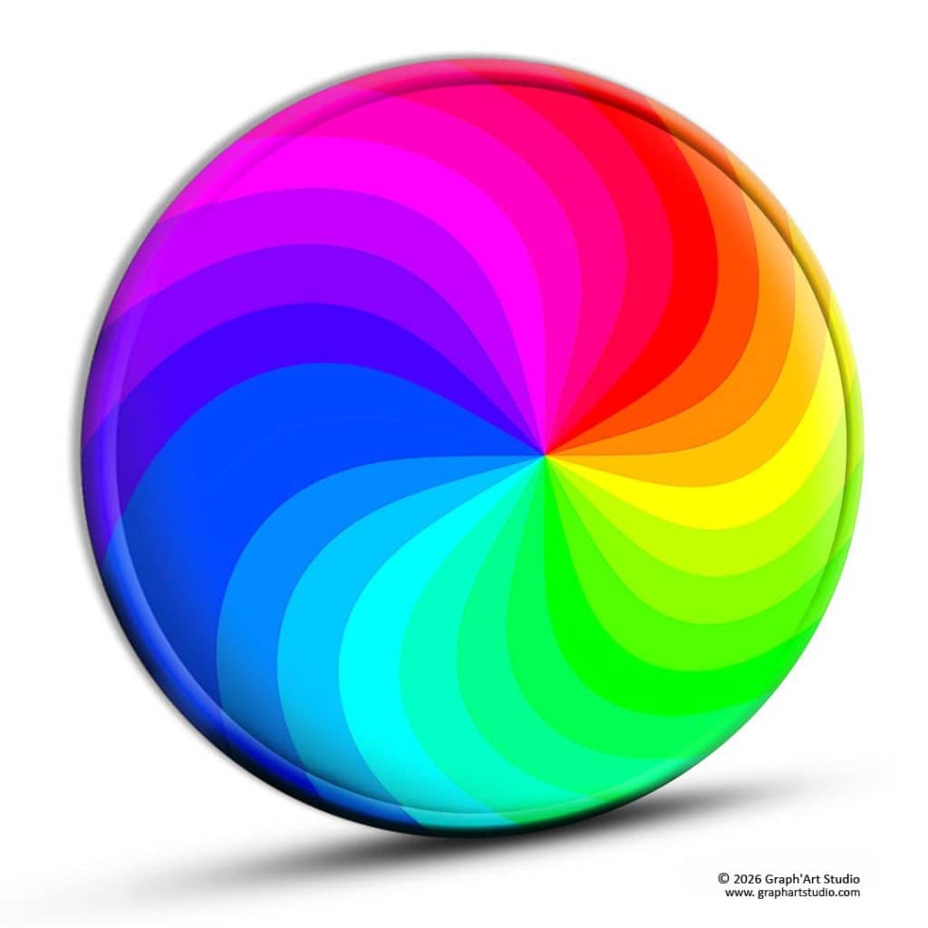
The color wheel is a reference tool for visualizing the organization of colors and the relationships they share. It is used to better understand how to combine hues, create harmonious contrasts, or balance a color palette.
Its circular shape makes it possible to observe the continuity between colors while easily identifying oppositions or visual correspondences.
It rests on a logical foundation, but also on a measure of intuition, and this is what makes it a valuable reference for beginners and image professionals alike.
In artistic or graphic creation, it helps identify a complementary color to make an element stand out, or to opt for analogous colors to create a fluid and harmonious atmosphere.
More complex schemes, such as the triad or tetrad, make it possible to introduce contrast while maintaining a balanced visual structure.
And beyond the studio or the screen, the color wheel finds its place in everyday life. Coordinating outfits, harmonizing an interior, choosing flowers or packaging… It serves as a guide for refining choices that would otherwise remain vague.
It helps avoid certain common mistakes, such as hues too close together that cancel each other out, or too far apart that clash.
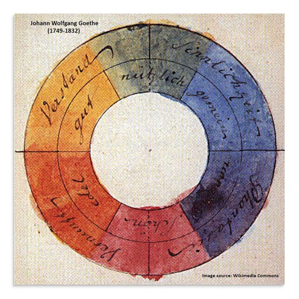
The idea of representing colors in a circle dates back to the 17th century, notably with the work of Newton. Later, artists and thinkers such as Goethe, Chevreul, and Itten enriched these approaches, blending science, sensation, and perception. These foundational works laid the groundwork for color theory as we know it today. The color wheel is one of its fundamentals. It serves painters, graphic designers, decorators, and visual content creators alike.
Primary, Secondary, and Tertiary Colors. How to Tell Them Apart
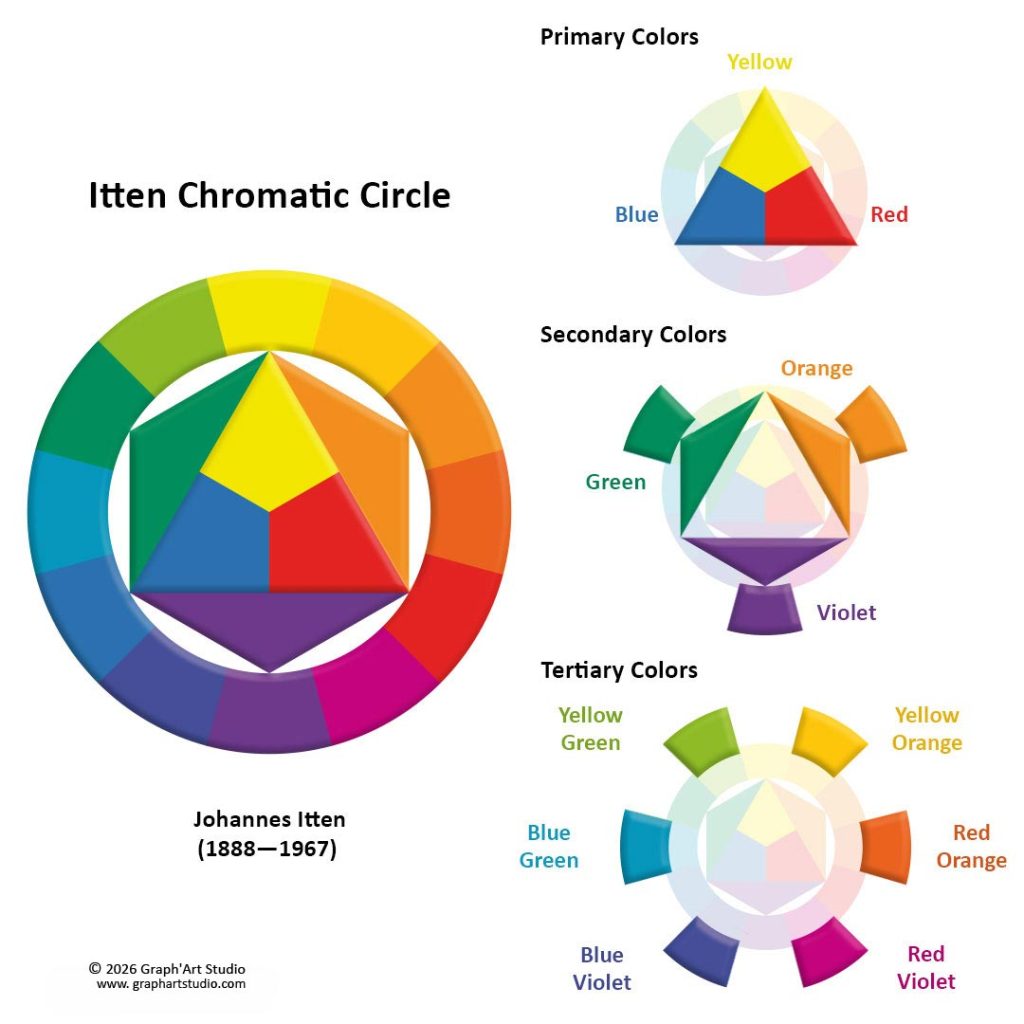
At the heart of the color wheel, we find the primary colors. Red, blue, and yellow. These are the base colors, the ones that cannot be obtained by mixing.
By combining two primary colors together, one obtains the secondary colors. Green, orange, and violet.
Finally, tertiary colors result from mixing a primary color with a neighboring secondary color. Examples include red-orange, blue-violet, and yellow-green.
Understanding this structure helps identify the balances and tensions in a composition more clearly. It is a simple but effective foundation for building a coherent palette.
Hue, Saturation, Brightness. The Three Pillars of Color
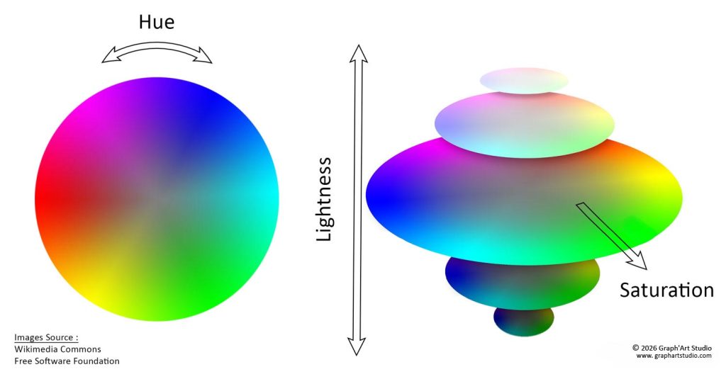
To fully understand a color, naming it is not enough. Three essential concepts make it possible to define it more precisely and adjust its visual effect. Hue, saturation, and brightness.
- Hue corresponds to the color family to which a shade belongs. We are talking here about red, blue, yellow, green, violet… Each hue is determined by its position on the color wheel. It is the first thing one perceives, what gives the overall identity. Two colors can share the same hue (for example, a blue), but look nothing alike if their saturation or brightness differs.
- Saturation refers to the level of purity of a color. A highly saturated color is intense, vivid, vibrant. A desaturated color becomes softer, more discreet, tending toward a colored gray. By reducing saturation, one attenuates the visual impact of a hue. This can be useful for creating muted, more subtle atmospheres, or for highlighting brighter elements within the same composition.
- Brightness, also called light value, refers to the amount of light a color contains. The higher this amount, the lighter the color appears. The lower it is, the darker the color seems.
For example, a pale yellow or a sky blue contain a great deal of light. They appear luminous, light, almost airy. Conversely, a burgundy or a forest green contain very little light. They seem denser, deeper.
Playing with brightness makes it possible to create depth, modulate visual hierarchy, or suggest a particular atmosphere, more open, more intimate, more dramatic…
These three parameters are at the heart of color theory. They interact constantly. By learning to observe and calibrate them, one can create subtle contrasts or soften a composition without altering the original hue. Visual expression gains in refinement, and it is often this work of balance that gives an image its coherence.
Color Harmonies. How to Combine Colors with Precision
Pairing the right colors is not a mysterious gift reserved for artists!
And for the skeptics who feel they lack taste… rest assured. The right combination is not always a matter of instinct, but often a question of structure.
Some combinations work because they rely on proven visual logics, drawn directly from color theory. Good news. These logics are not reserved for the initiated… they are creatures that tame themselves quite easily.
Among the tools at our disposal, the color wheel is undoubtedly the most used, and for good reason. It offers a clear overview of the relationships between colors.
But it is not the only possible reference. Observing nature, photography, certain artworks, or even digital tools such as palette generators can also guide the choice of hues.
Depending on the desired effect, whether to soothe a mood, strengthen a contrast, energize a composition, or balance a palette, several approaches exist. I will focus mainly on the most common structures, those that already transform a hesitant choice into a more confident combination.
Complementary Colors. A Powerful and Controlled Contrast
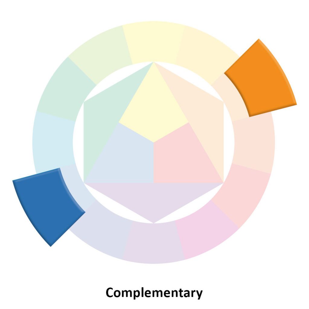
On the color wheel, complementary colors are those that sit directly opposite each other. Blue and orange, red and green, or violet and yellow are the classic examples.

But this logic adapts to many other shades. In my former visual identity, for example, blue was highlighted by touches of golden brown, its balanced complementary. This combination works because it plays on both contrast and softness. It is a visual dialogue that captures without aggressing.
Placed side by side, complementary colors reinforce each other. It is a dynamic duo, ideal when one wishes to draw attention or highlight a key element.
This dynamic can be found in many visual worlds, whether natural, artistic, or commercial. A blue sky crossed by an orange glow at sunset is an obvious example.
Throughout art history, painters have always known how to exploit this subtle dynamic. One thinks, for example, of green backgrounds that bring out the red tones of a garment in certain classical portraits. These choices were never incidental. They made it possible to guide the gaze without ever unsettling the composition.
In marketing or graphic design, complementary colors have become a strategic visual code. These oppositions are designed to stimulate attention, create a visual rhythm, or simply facilitate the retention of a message.
But this harmony requires a certain balance. Used in equal proportions, complementary colors can compete and become visually tiring. It is therefore advisable to choose one as the dominant, then use its complementary in discrete touches, to underline without saturating.
Complementary harmony is powerful, but like any strong contrast, it benefits from being modulated with finesse.
Analogous Colors. Softness and Visual Fluidity
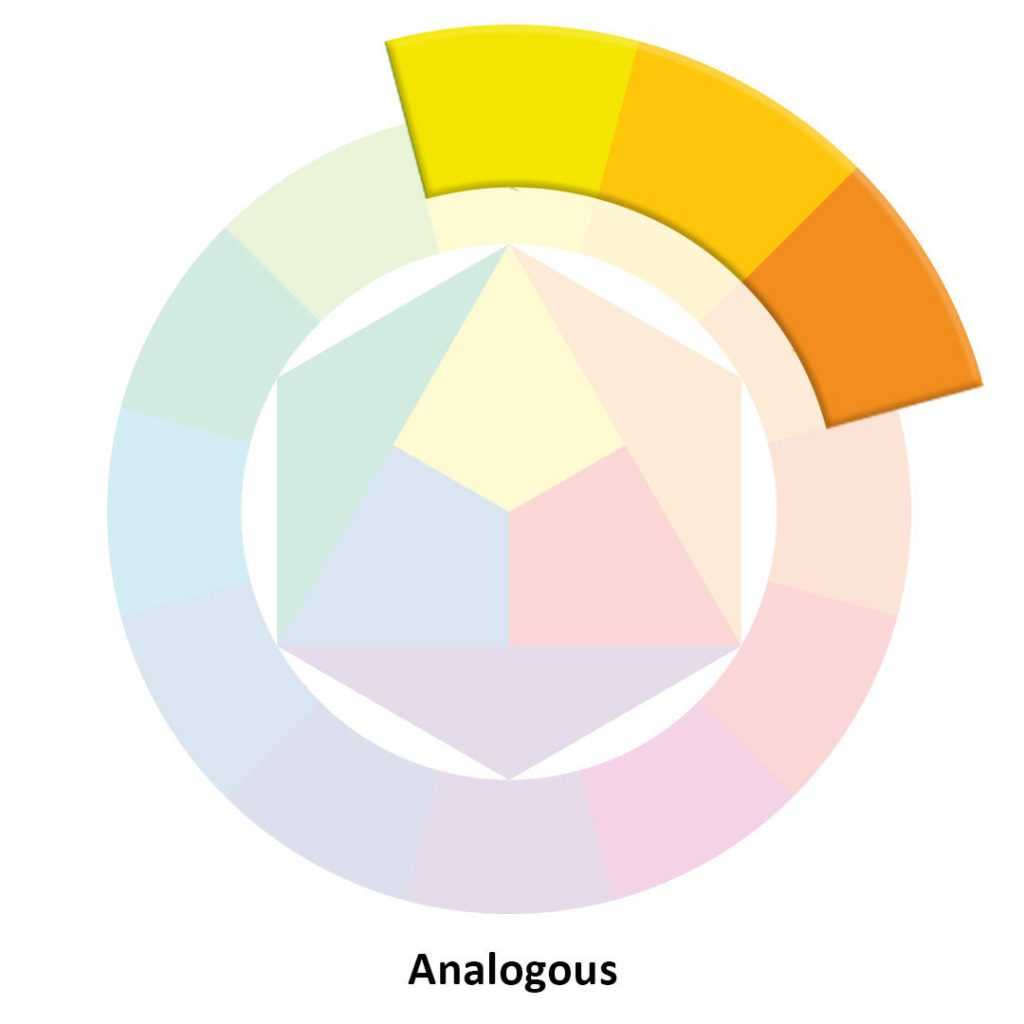
Analogous colors are neighbors on the color wheel. And because they share a common element (a similar temperature, a kinship of hue), they naturally harmonize, without discord.
They read like a breath. When well chosen, they build a natural, almost imperceptible visual continuity, that soothes the gaze and establishes a harmonious atmosphere.
Imagine a range of sky blue, blue-gray, water green… or a transition from brick red to terracotta, then to rosy beige.
These analogous palettes are widely used to build enveloping atmospheres, in a naturally decorated living room, a poetic illustration, or a delicate floral arrangement.
It is the same principle found in nature, when leaves shift from bright green to golden yellow, then to copper ochre in autumn. This gradual but coherent shift of hues creates a soothing visual rhythm.
One can also think of certain traditional Japanese paintings, where hues unfold around greens, blues, and slightly tinted grays. This discreet continuity establishes a peaceful, almost meditative atmosphere.
The appeal of analogous colors is precisely this. They accompany.
In a graphic composition, an analogous harmony can guide the gaze without jarring it.
In an interior, it is what allows a painted wall, a curtain, and a decorative object to converse without ever competing.
Analogous harmony does not seek to attract the eye. It seeks to hold it. And its fields of action are infinite.
The Triad. Three Colors in Dynamic Balance
Triadic harmony rests on an equilateral triangle drawn inside the color wheel. It connects three equidistant colors, creating a stable structure where each hue has its place.
The combination of red, yellow, and blue is the best-known example, but it can also bring together more unexpected shades, such as a soft turquoise, a slightly orange coral, and a plum violet.
This type of combination brings variety without causing imbalance, provided it is dosed with care. For three very distinct colors, if used in equal proportions, can quickly saturate the composition.
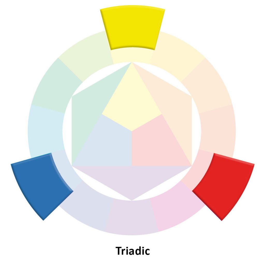
To avoid this overly colorful effect, one can play with proportions. One color becomes dominant, the second accompanies, the third serves as an accent.
One can also reduce the saturation of one or two of the colors, to bring depth without overload.
This harmony works particularly well when one wants to create a dynamic but coherent composition, with a certain visual rhythm.
In an illustrated poster, for example, it can make elements converse with energy without the whole appearing too busy.
In the world of art, this structure can be found in certain 20th-century still lifes, where a blue-gray background, an ochre yellow ceramic, and a few deep red fruits compose a sober but intensely balanced scene. This distribution allows each hue to retain its singularity while serving a shared atmosphere.
The color triad is ideal for energizing a palette while preserving visual unity, particularly in graphic compositions that call for contrast and rhythm without falling into excess.
Other Types of Harmonies to Explore
Beyond the most common schemes, the color wheel offers other visual configurations that are worth exploring. I will not develop them in detail here, as the most accessible and most used remain those we have already seen. But they are worth naming.
- The tetrad combines four colors organized in two pairs of complementaries. It can yield rich palettes, provided the hues are well hierarchized.
- Monochromatic harmony is built around a single color, playing on its brightness and saturation. The result is often sober, elegant, very readable.
- Split complementaries, finally, soften the contrast. The dynamic is preserved, but without the frontal opposition of a pure complementary duo.
To Conclude… or How to Unlearn the Rules with Elegance
Let us be honest. No scheme holds the absolute truth. One can follow the rules, adapt them… or ignore them with panache.
What matters most is the intention. The artist’s or creator’s intention, what they wish to make one feel, and how they choose to achieve it. Exploring these harmonies means entering color theory through practice, and opening one’s gaze.
One can practice in a sketchbook, create mini palettes, use online tools, or return to the basics to visualize the interactions. But one can also do it with scraps of fabric, flowers, cut-out images, a little light… and a great deal of curiosity.
The essential thing is to dare to explore…
And if nothing “works”? Then perhaps it was never about finding the right combination, just yours.
The Art of Color Gradients and Visual Transitions
Why Gradients Are More Than Simple Visual Effects
A gradient is often perceived as a graphic effect, sometimes decorative… And yet, it does far more than “blend” two hues. In a visual, pictorial, photographic, or digital composition, it acts as a breathing zone. It allows color to move from one state to another without rupture, to accompany the gaze without interrupting it, and to establish a continuity where too sharp a contrast would create a fracture.
A successful gradient does not fill a space. It carries a chromatic intention. In a painted landscape, it can slide light from a deep blue to a pale yellow, as if the image were translating a nuance of weather. In digital creation, it can add depth, softness, sometimes even a very simple and very effective visual emotion.
This is what makes it so precious, even in highly structured works.
The Different Types of Color Gradients
Not all gradients look alike. Depending on their orientation, their construction, or their graphic use, they do not have the same impact on the composition. Knowing them helps above all in choosing the right tool in the right place, without forcing the effect.
The linear gradient progresses in a single direction. It structures the space, suggests a progression, and can guide the gaze without rigidifying the composition.
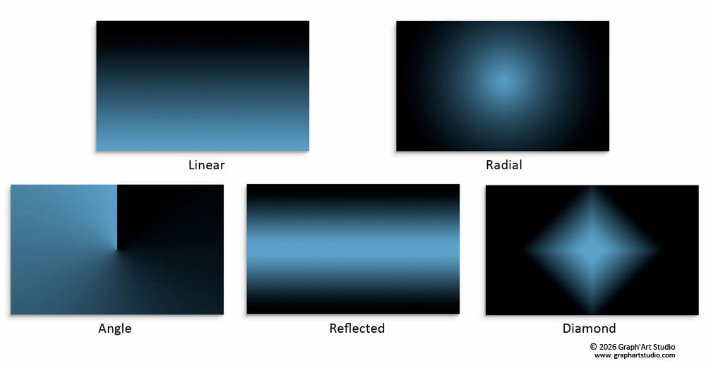
The radial gradient starts from a central point and spreads outward. It evokes a halo, a light, a focal point, and draws the eye without a hard contour.
There are also more specific variations depending on the software. Some play with symmetry, geometry, or the axis of diffusion. They can be useful, but benefit from remaining in service of the subject, not the other way around.
And Tone on Tone?
It is not a gradient type in itself, rather an approach.
It involves playing with variations of a single hue, from darkest to lightest, from most saturated to most muted. This technique can be applied to any type of gradient. The result is often softer, more elegant, sometimes very minimalist.
When to Choose One Over the Other?
The linear structures the space. The radial refocuses attention. The reflected can suggest a symmetry or a mirror effect…
As always, these tools are there to be explored, tested, sometimes repurposed.
The essential thing is not to follow a rule, but to feel what, in a shade or a direction, best serves the message… and the emotion.
Common Mistakes to Avoid with Gradients
While the gradient is a valuable visual tool, it can also become a trap when poorly mastered. Certain mistakes, frequent but avoidable, can make it too visible or too mechanical.
- Overly abrupt breaks. A gradient must remain fluid. If the transition shifts too brutally, it segments rather than connects. It then becomes “rigid,” sometimes even unsettling.
- Poorly matched hues. Another common pitfall lies in the choice of colors. Hues too far apart on the color wheel, or conversely too close but poorly balanced, can produce a dull, unbalanced, even dissonant result.
- Too much contrast, not enough progression. Some gradients fail not because of the colors chosen, but because of the absence of natural progression between them. An intermediate step may be missing, a subtle variation in brightness or saturation, to make the transition more natural.
A Few Tips for a More Natural Result
- Limit the number of vivid colors in a single gradient and favor halftones.
- Work the saturation by slightly reducing the intensity of at least one hue to avoid the “sliding effect.”
- Observe natural light, or draw inspiration from the transitions found in nature. The sky, shadows on skin, reflections in water.
- Test on various surfaces, as a gradient can react differently depending on whether it is applied to a light, textured, or very colorful background.
A successful gradient is often recognized by its discretion. It imposes nothing, but accompanies. And it is often in restraint that it reveals its full strength.
As a digital painter, I work with deeply saturated colors. These palette decisions, I feel them at every Fine Art print.
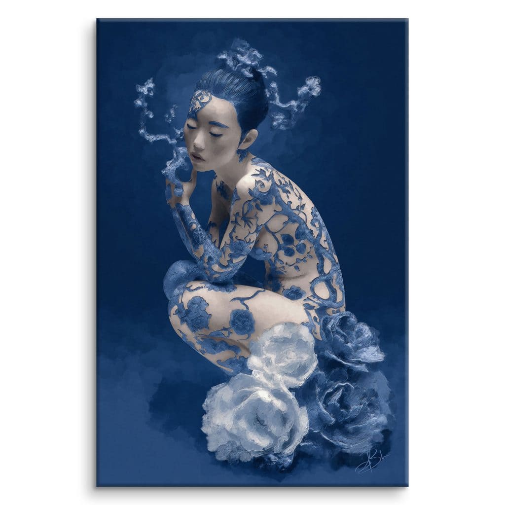
In my process, the background never comes as an afterthought. It is born from the subject, almost at the same time. A slightly golden background can emerge from a reflection on the neckline of a horse.
A deep red can take root in a flower. The gradient then becomes a continuity. It supports the subject without swallowing it.
To go further on what these hues go through at printing, I have dedicated a full article to color space, from ICC profiles to the final result.
To discover a few examples, I invite you to explore my artworks.
And if you are still hesitant about the medium that suits your work, I discuss it in a dedicated guide.
And if you wish to bring yours to life, I would be delighted to imagine its colors with you. Contact me
Creating a Color Palette. Follow Your Instinct or a Method?
Even before drawing a line or laying the first hue, choosing a palette means already entering the image. Everyone has their own way, more instinctive or more structured, but this step often remains a true compass before beginning.
For me, it is a kind of ritual, a way of connecting to what is about to come into being, and of creating a space conducive to the composition.
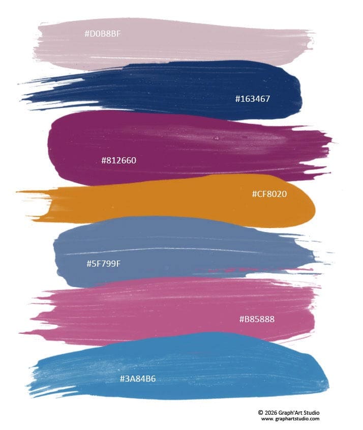
I will not pretend to know how other artists work. Each has their habits, their intuitions, their beliefs, their rituals…
But for me, this step is an essential entry point. It is not only a question of aesthetics, but a way of preparing the ground in alignment with what the image calls for.
Why Define a Color Palette Before Starting a Project?
Defining a palette in advance gives a direction.
A well-considered color palette makes it possible to anticipate the overall rhythm of the image… The temperature of the hues, their intensity, the contrasts one accepts, the transitions one senses.
It brings coherence to spontaneity. Without constraining, it prevents dispersion, channels energy, and makes the intention more legible.
Finally, defining a harmonious palette means giving oneself a flexible framework, in which creativity can move freely. One knows where one is starting from, even if (let us be honest) one does not always know very well where one is going. But at least one goes there with the right colors…
Three Approaches for Building a Harmonious Color Palette
There is not just one way to compose a color palette.
Some prepare it like a screenplay. Others feel it, sense it, without always being able to explain why. The one that sets the overall atmosphere.
Here are three approaches that, far from opposing each other, can sometimes intersect, or speak to one another.
The Emotional Palette
It is perhaps the most instinctive… and the most demanding.
It rests on a single question. What emotion do you wish to convey?
Warm, deep colors to evoke intimacy, light and clear tones for joy or spontaneity, muted hues for a melancholic atmosphere…
This type of palette does not necessarily seek precision. Here, emotional accuracy takes precedence over fidelity to reality. This approach is ideal when one wants to convey an atmosphere, rather than represent a subject.
The Thematic Palette
Here, color serves the subject.
In a thematic palette, colors are chosen in connection with a specific universe or subject. A season, a culture, a natural scene, a traditional costume, or even a texture.
This approach often blends with intuition, depending on the project.
This method gives a strong visual coherence, while leaving room for personal choices.
The Intuitive Palette
It is the one with no plan.
It builds itself as the eye moves, as colors call to or repel each other.
One advances by feeling, placing colors one after another until something “rings true.”
This approach can seem fluid, instinctive, yet is surprisingly revealing of what one carries within.
It makes room for the unexpected, for the detail that changes everything, for the color one had not planned… but which ends up becoming central.
None of these approaches is better than another. Some works are born from a clear logic, others from a freer impulse, guided by feeling alone.
Sometimes an artistic palette begins thematically, takes an intuitive turn, and closes on an emotion one had not sought.
The essential thing is to choose one’s colors consciously, or to know when to stop when the precision is there… even if one cannot quite explain why.
How to Balance Color Diversity and Keep the Equilibrium
Creating a harmonious palette is not only about choosing beautiful colors. It is also about knowing how to dose them, distribute them, and give each one a role.
A good composition often rests on a discreet balance between tension and restraint, between presence and silence.
Choosing a Dominant Color… and Letting the Others Play Around It
In most visually balanced works, one finds a dominant color, the one that sets the general atmosphere.
Alongside it, one or two secondary colors accompany it, add nuance.
And sometimes, an accent color punctuates the whole, highlighting a detail.
This simple principle makes it possible to avoid the “color overload” effect, while preserving genuine visual richness.
Leaving Space for the Colors to Breathe
In a palette, chromatic silence is just as important as the color itself.
Leaving a more neutral zone, or simply less saturated, allows the other hues to reveal themselves more fully.
A calm zone, slightly grayed or desaturated, allows the eye to settle, to breathe… before setting off again. A bit like white space in a text, or a short sentence in the middle of a dense paragraph. This pause gives weight to what preceded, and prepares what follows.
Avoiding the “Rainbow Effect” or Lack of Contrast
One of the frequent mistakes is wanting to say everything at once. Too many vivid colors, too many competing shades… and the eye no longer knows where to go.
Conversely, a palette that is too timid can lack impact, especially if the hues are too close or all saturated in the same way.
It is all a matter of visual rhythm. Making contrasts and harmonies speak to each other, dominants and breathing spaces.
It is not an exact science, but a balance to be felt, adjusted.
Of course, all of this is merely a possible framework, one reading among others. Reference points for those who feel the need, or the desire.
While others prefer to free themselves from any method. They advance by instinct, let colors emerge without organizing them, and give birth to raw works… sometimes deeply moving.
But it also depends on the context in which one creates. The expectations are not the same when composing for a personal artistic work, a custom commission, or a visual project for commercial use.
Some constraints invite rigor, others leave full room for intuition.
So perhaps the essential thing is not so much to build a palette… as to let one’s own way of inhabiting color emerge.
There are no rules to follow, only impulses to listen to.
Finding the Right Balance. Tips for Composing Your Palette

Creating a color palette is a subtle blend of instinct and adjustment. Even when intuition is there, a small technical step back often helps strengthen the precision of the result.
Here are a few reference points for refining your choice… without bridling your sensitivity.
Using Tools Without Getting Stuck
The color wheel remains an excellent starting point. It helps visualize quickly the links between hues and possible harmonies. And before finalizing a palette, it is often useful to test one or two variants on a draft, paper or digital.
Inspiration often comes from the real world. Nature, a film frame, a fabric, an urban scene at the right moment. Observing palettes that already exist means learning to read color in context.
Too Much or Not Enough? Finding the Right Middle Ground
An overloaded palette is easy to spot. Everything competes. Conversely, a palette that is too timid lacks drive. The important thing is knowing how to adjust. The right setting often comes through small corrections, depending on the medium, the light, the intention.
And if in doubt, nothing prevents drawing inspiration from existing palettes, whether from the old masters, successful posters, or a sunset. The essential thing is not to copy, but to understand why it works… and to draw nourishment from it.
Why Use Online Tools to Create Your Palette?
When inspiration is there, but one is still looking for the right combination, digital palette creation tools can truly help.
They do not replace the eye, but can stimulate it, sharpen it… or simply save time in a creative process.
Creating a harmonious color palette by hand can sometimes take time, especially when one hesitates, tries to step out of one’s habits… or has not yet found that small chromatic spark that launches an idea.
Online palette generators make it possible to quickly test several combinations, generate unexpected associations, or simply let oneself be surprised by a visual proposal.
It is also a flexible way to explore color combinations. One can keep what works, set aside what does not speak, lock a hue one likes and vary the others around it to build a balanced and personalized palette.
Whether working on an artwork, a graphic creation, a moodboard, an interior decoration project, or a custom commission, these tools offer a visual playground without particular constraints.
It is an immediate source of inspiration that can help unlock a hesitant choice, start an atmosphere, or simply nourish the eye.
📌 To discover an up-to-date selection of the best free online tools (palette generators, harmony resources, color simulators…), head to the end of this article.
Conclusion. Taming Colors, a Sensitive and Personal Path
If there is one thing to remember, it is that color is not learned in a straight line. It cannot be reduced to a theory, and it cannot be mastered in a single reading.
One can understand the basics, become familiar with its tools, explore its logics… but in the end, everything depends on creative intention, context, and the gaze one brings to what one wishes to bring into being.
At its core, knowing the fundamentals of color theory is not about confining creation. It is about gaining freedom, and moving forward with greater confidence. Color then becomes a full means of communication, accessible, alive, and deeply personal.
It is a universal visual language, within reach of all those who take the time to pay attention. No need to be a professional. Sometimes it is enough to look differently, to dare to experiment, to let an intuition guide you.
And the good news is that one often progresses faster than one thinks.
If you wish to see how all of this translates into images, you are welcome to step into my world. That is where my colors speak.
Bonus. Tools and Reads to Explore Color Theory
Books for Understanding Color Theory and Improving Your Artistic Practice
The Art of Color – Johannes Itten
A timeless classic for understanding contrasts, harmonies, and the construction of the color wheel. Published in the 20th century by Johannes Itten, a Bauhaus teacher, the work offers both a theoretical and intuitive approach to color. Depending on the period, some editions may be difficult to find new.
The Little Book of Color – Michel Pastoureau & Dominique Simonnet
A deep dive into the symbolism of colors through history and cultures. Accessible and erudite, ideal for enriching one’s color sensitivity.
Interaction of Color – Josef Albers
Based on visual exercises, this work explores how colors interact with each other. Perfect for sharpening the eye and understanding chromatic illusions.
The Harmony of Colors – Tina Sutton
A practical guide with palettes and advice for creating effective harmonies.
The Colors of Art, the History of Art in 80 Palettes – Chloë Ashby
A journey through 80 iconic works, analyzed through the lens of their color palette. Inspiring for seeing how the masters used color.
Colors! Color Theory in Practice – Éditions de Saxe
Offers 16 watercolor and gouache projects for concretely applying color theory. Ideal for artists wishing to experiment.
Free Online Tools and Sites for Creating Color Palettes and Practicing Harmony
Adobe Color, precise and comprehensive
A very comprehensive tool based on the color wheel, allowing the creation of harmonious palettes according to different rules (analogous, complementary, triadic…). It also offers the ability to extract palettes from images.
• Color-Hex, the essential tool for exploring shared palettes
A very practical site for exploring a color, its equivalents (RGB, HSL, CMYK), and associated harmonies. Useful for analyzing and varying a hue with concrete reference points.
• Coolors, fast, simple, and intuitive
A fast and intuitive palette generator. Press the space bar to generate new palettes, lock the colors you like, and easily export your combinations (some advanced features are in Pro version).
• Canva Color Palette Generator, extract a palette from an image
Upload an image, and Canva will automatically extract a color palette based on it. Ideal for creating coherent palettes from your visuals.
https://www.canva.com/colors/color-palette-generator
• Colormind, generate palettes with artificial intelligence
Uses artificial intelligence to generate harmonious palettes. It can analyze an image and suggest colors based on the main hues.
• ColorSpace, develop a color into a harmony or gradient
Generate gradients and palettes from a single color. Ideal for creating a coherent visual identity.
• Color Hunt, trend palettes ready to use
A collection of palettes created by designers from around the world. Browse palettes by popularity, trend, or novelty.
• Khroma, an AI that learns your tastes
A tool apart. Here, the algorithm adapts to your personal preferences. You manually select colors you like, and Khroma generates custom palettes, as well as usage examples.
Frequently Asked Questions About Colors
What is the color wheel for?
It is a map of colors and their relationships. It places the hues in a circle to show at a glance which ones oppose each other and which ones resemble each other. You can easily spot a complementary that will make an element stand out, or neighbors that will set a soft atmosphere. A precious landmark when a color choice remains unclear.
What is the difference between complementary and analogous colors?
Complementaries face each other on the color wheel, like blue and orange. Side by side, they reinforce one another and create a contrast that draws the eye. Analogous colors, on the other hand, are neighbors, and share a kinship of hue that lets them glide into one another without clashing. The first ones awaken, the second ones soothe.
What do hue, saturation and brightness mean?
They are the three ways of describing a color. Hue names its family, on the side of red or blue. Saturation tells its intensity, from a frank and vibrant color to a muted gray. Brightness, for its part, measures the light it contains, from the lightest to the deepest. Two blues of the same hue can feel like strangers to one another if their saturation or their brightness differs.
How do you build a harmonious color palette?
There are several paths. Starting from an emotion to convey, starting from a subject or a season, or moving purely by feel, laying down the colors until something rings true. For my part, choosing my palette has become a kind of ritual, my way of connecting with the image before I have even laid down the first stroke.
How do you achieve a natural color gradient?
By giving it time to breathe. A gradient that shifts too fast segments instead of linking, even though a sharp break can perfectly well be a deliberate choice. I limit the number of frank colors, I lower the saturation of one of them a little, and I look at how light makes its transitions in nature. A good gradient is often noticed for its discretion, or precisely because one decided to make it visible. The essential thing is that it remains an intention.

